Happy Wednesday and welcome back to Part 2 of our Trinidad Reveal. If you haven’t read Part you need to stop what you’re doing and read it!
As I mentioned in our previous blog post, this home was designed with three major living spaces - Living Room, the Loft, and an expansive Lanai.
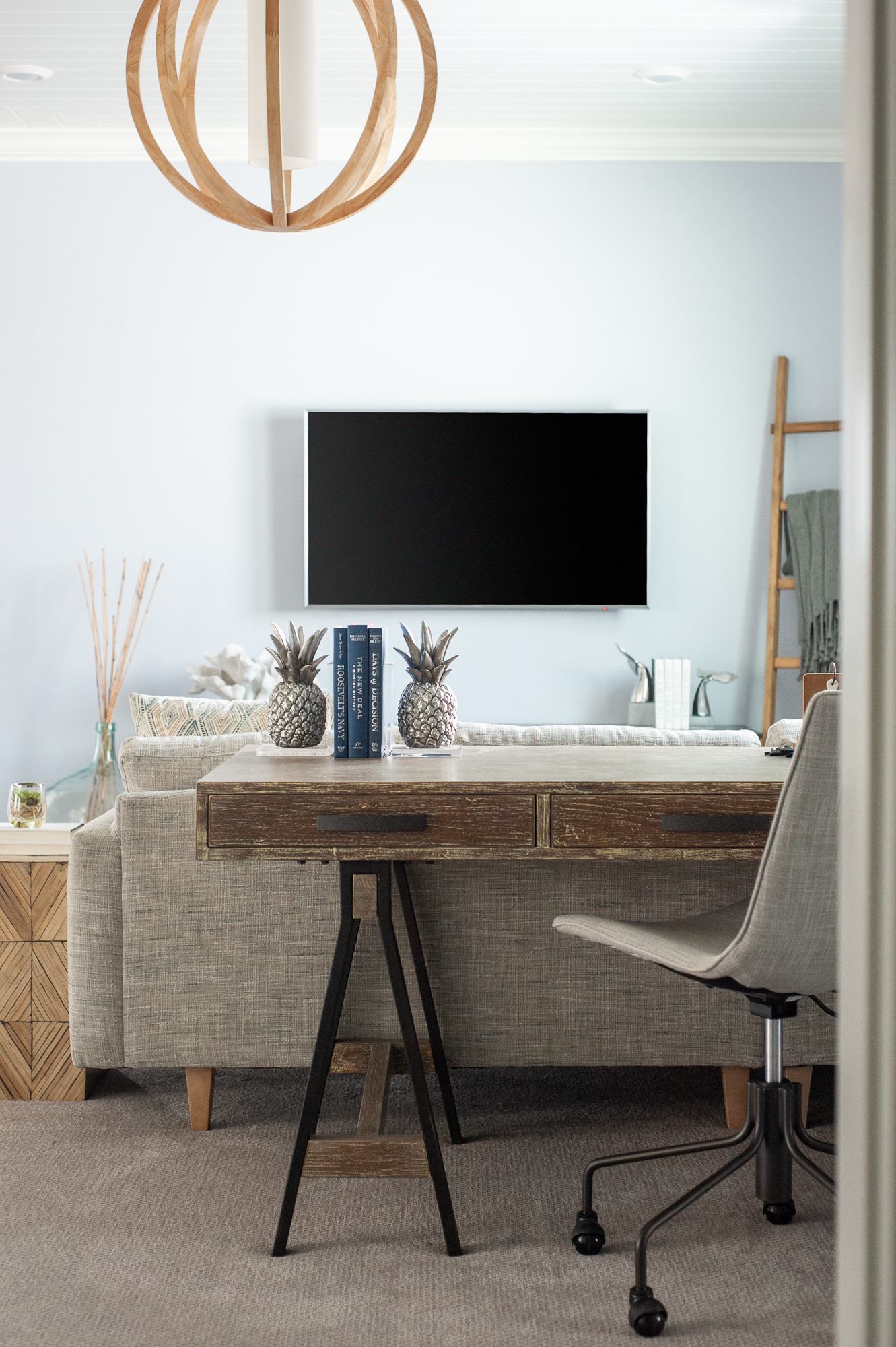
The Loft was designed as a space to hangout for the 3 secondary bedrooms that are located on the second floor. We incorporated a sectional for a place to lounge, and a desk behind the sectional for a area to complete homework.
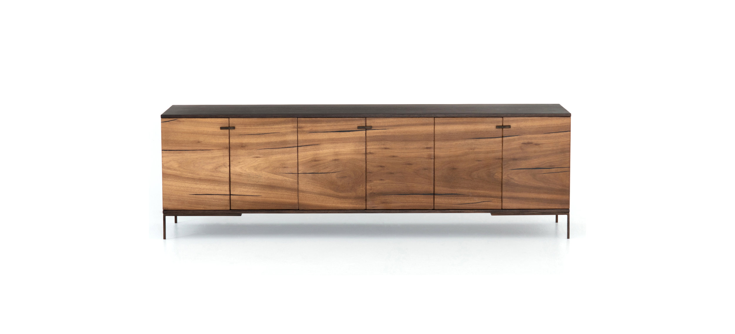
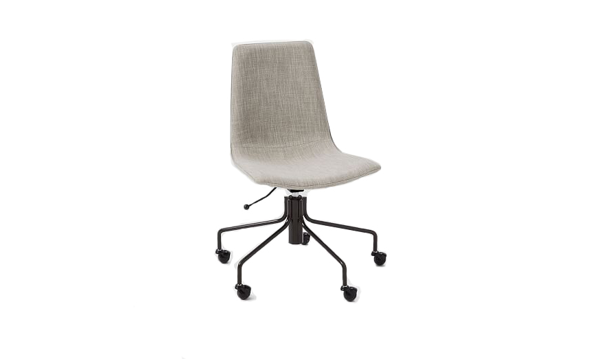
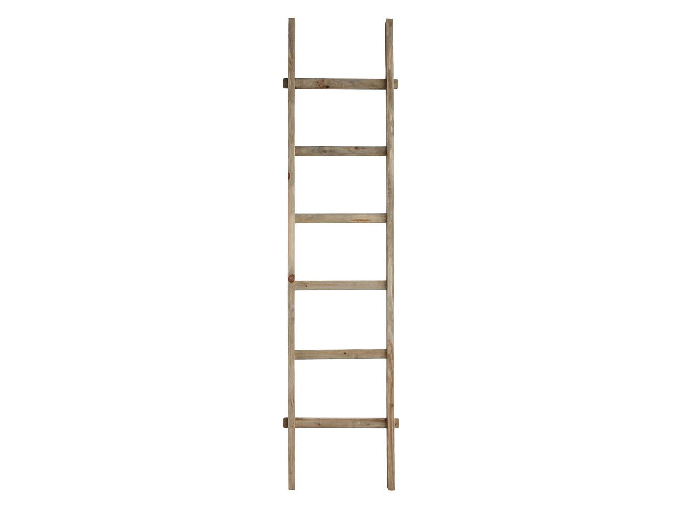
SHOP THE LOOK
This bedroom is a secondary Owner’s Suite upstairs, which would be great for an older parent or a caretaker. In this case, we designed it for a college aged boy who comes home every now and then, but can also be used as a guest suite while he’s not home.
We used a lot of wood and trim throughout the home and wanted to incorporate it in this room, but didn’t want to break the bank. So we decided to use a wallpaper that gave the look of narrow shiplap.
PRO TIP:
Wallpaper is a great, less expensive alternative to trim work!
SHOP THE LOOK
This secondary Owner’s Suite has a large en-suite bathroom with a gorgeous frame-less shower. We took the subway tile all the way to the ceiling to draw your eye up the space. We also used an adorable plaid wallpaper in the entire bathroom. The wooden mirror and those floating shelves above the toilet are the finishing touches, adding texture and warmth.
SHOP THE LOOK
On the other side of the Loft are two bedrooms we designed for the kids - one in elementary school and one in middle school. The two bedrooms are separated by a cozy Jack & Jill bath.
SHOP THE LOOK
This girl’s room is what boho dreams are made of! We used lattice like wall decor in place of a headboard, which is a great alternative if you’re on a budget.
SHOP THE LOOK
And we can’t forget about the laundry room!
Thanks for reading Part 2 of our Trinidad home tour! Until next time :)


