Happy Thursday friends! I’m excited to finally debut one of the many model homes we’ve completed in the last month or so - The Tivoli Model.
This model was designed around a family of four that loves entertaining and hosting guests. I’ve been really loving the products from Brooke & Lou lately and wanted to incorporate them in this model home. With spring just arriving I went with a bright and airy color palette, with pops of green and blue throughout.
Once you walk into the home you’re greeted by this cute little moment in the foyer. A shallow console was chosen to accommodate the narrow hallway. The guest room is also at the front of the house - directly off the foyer.
Upon entering the guest room you’ll find another shallow console, which is a great place for guests to set down their belongings down. It also makes for an adorable vignette! The guest room was designed to be welcoming and serene. And what could be more serene than a pink and blue room?
SHOP THE LOOK
The formal dining room is right off the foyer and the guest room. This is probably my favorite room in the house, because it’s so central to the kitchen and the living room. Not to mention that adorable wainscoting with the vertical shiplap…
SHOP THE LOOK
The formal dining room opens up to the living room as well as this expansive kitchen. The angular island really breaks the space up into two separate dining areas with the breakfast nook tucked away in the corner. The floating kitchen island lends itself to more seating as well as storage.
SHOP THE LOOK
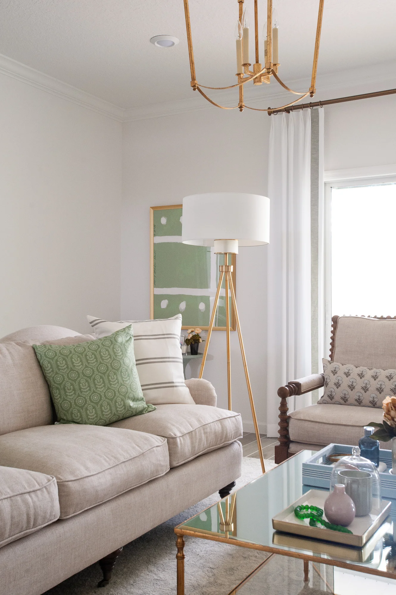
Okay… I know I said the formal dining room is my favorite room already, but the living room is definitely a close second. As I mentioned earlier I’ve been loving everything Bria Hammel has been curating for Brooke & Lou, so I knew I had to use her pillows in this home. After looking through her shop I couldn’t help but fall in love with her exclusive artwork too, so obviously I had to use that in this space as well.
SHOP THE LOOK
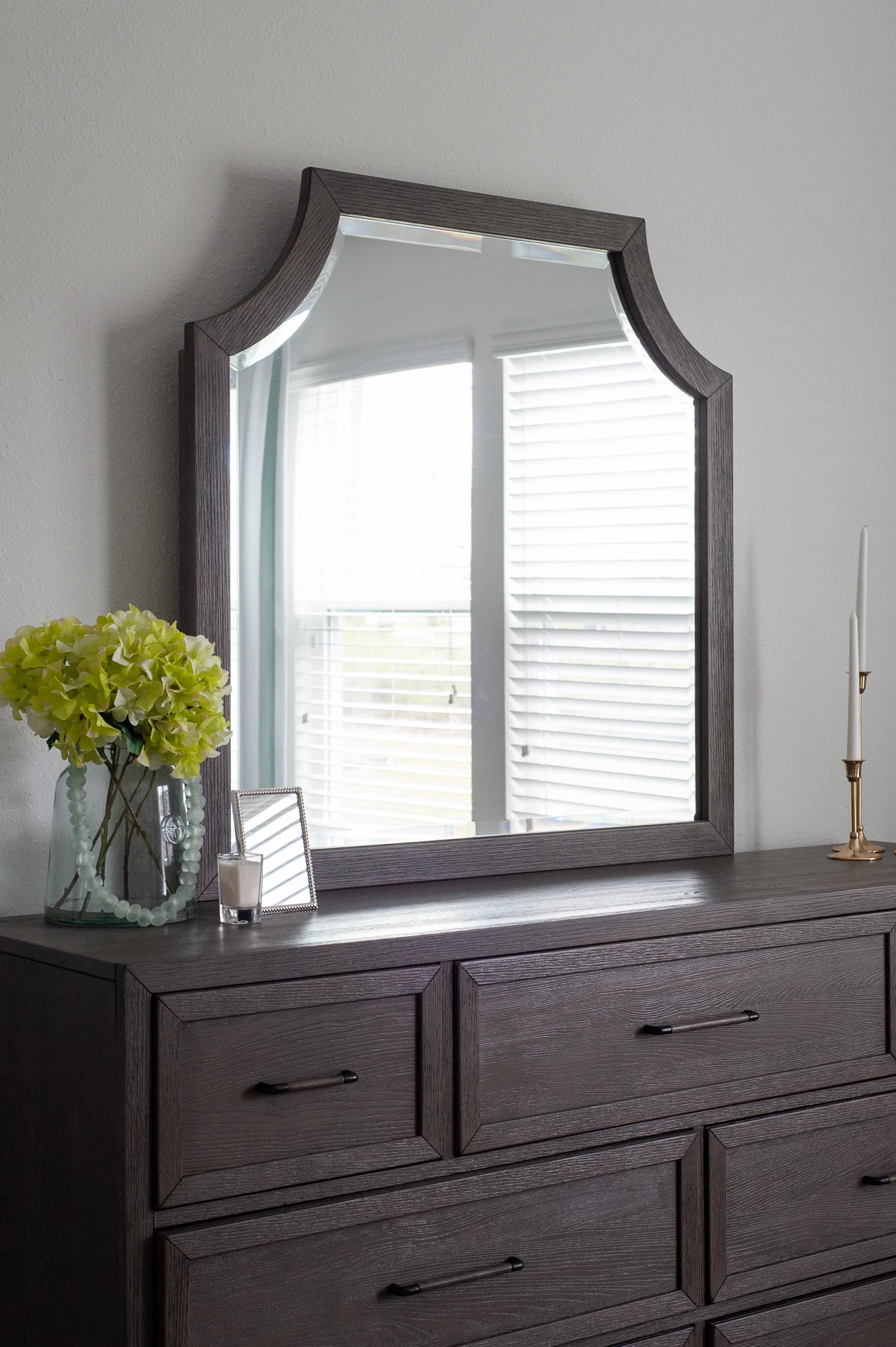
Just like the guest room, I wanted the owner’s suite to feel like a retreat for the home owners. Vertical shiplap was utilized in the formal dining room as well as the living room, and again here in the owner’s suite, however the accent wall was painted a serene shade of blue.
Even though the rest of the home feels very casual and relaxed, I wanted the owner’s suite to feel elevated but still have that cozy element to it. This look was achieved by using the same blue and green color palette as the rest of the home, but adding a few feminine touches. Such as the pink lamps, the white duvet with an embroidered detail, and the subtle floral fabrics.
SHOP THE LOOK
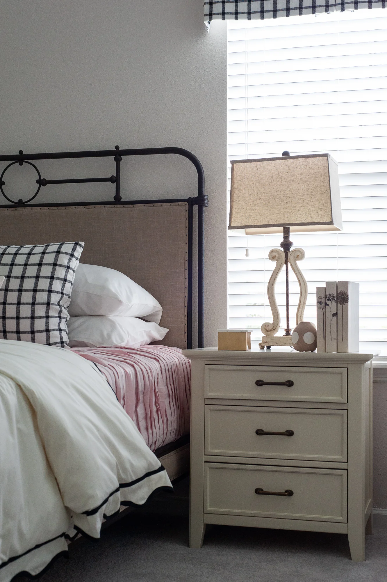
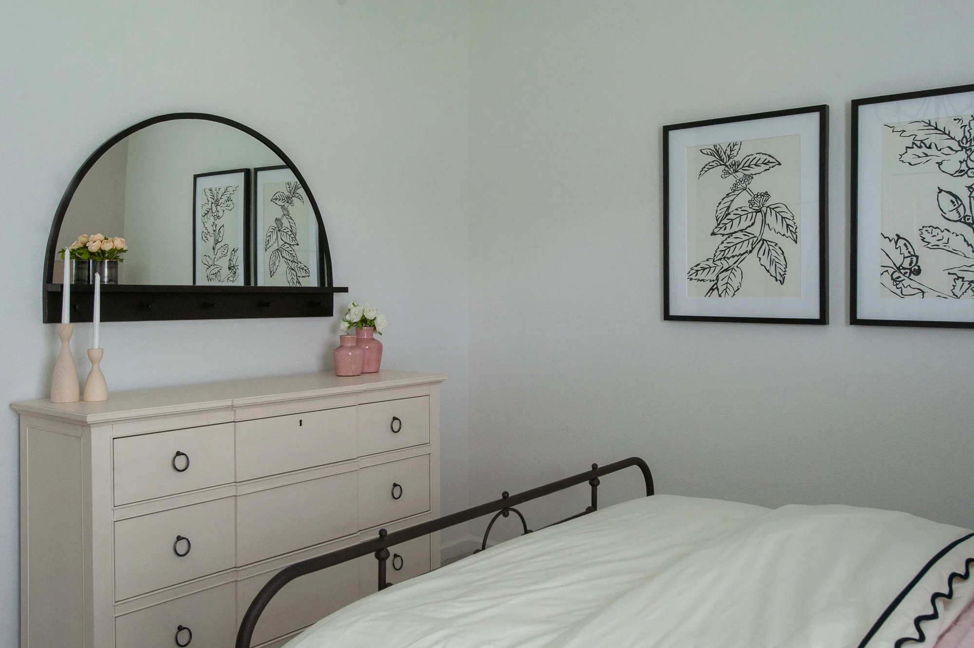
Believe it or not, but the inspiration for this girl’s room started with the artwork. It took on it’s own feminine farmhouse look while still being suitable for a teenage girl.
SHOP THE LOOK
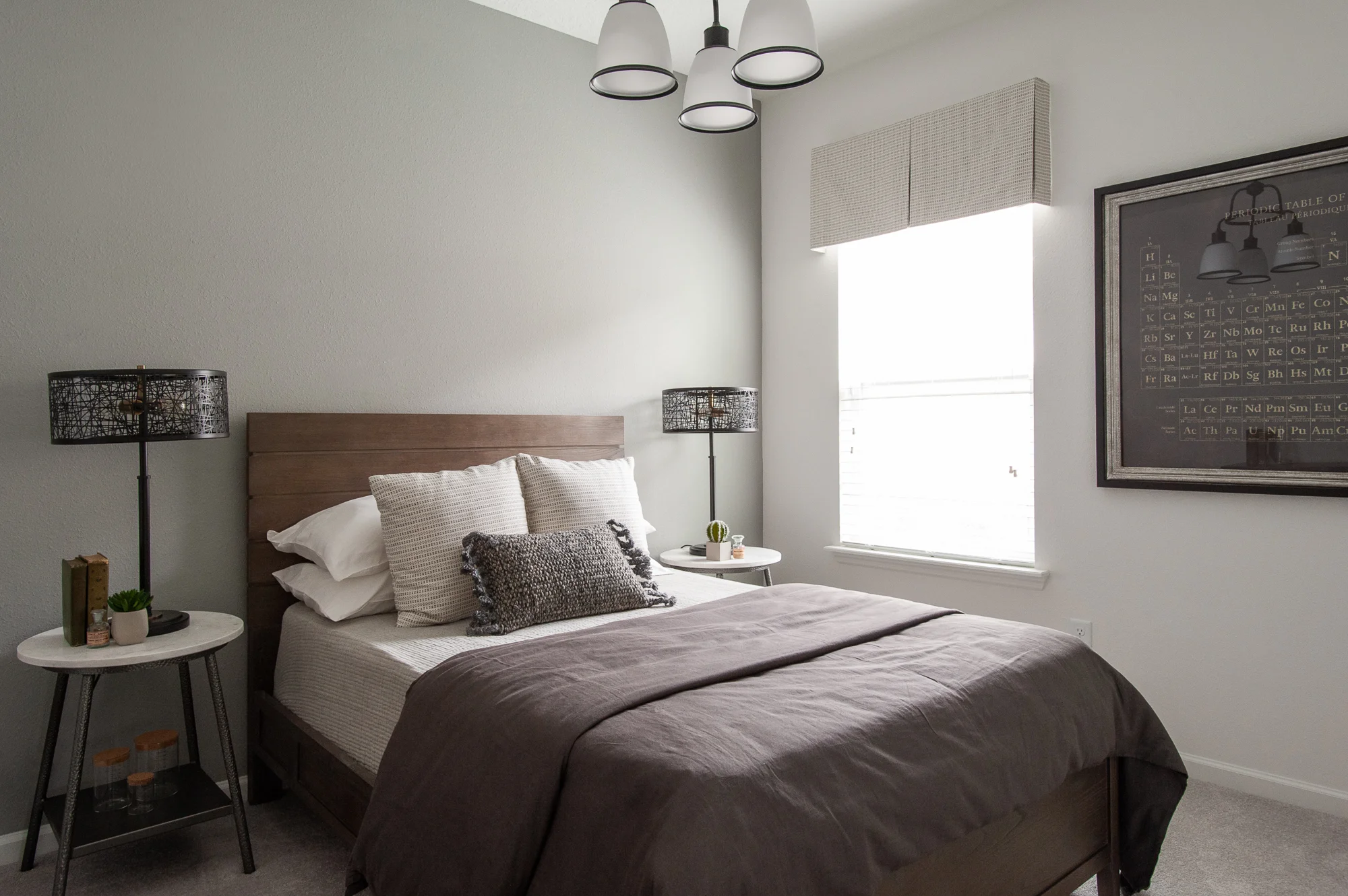
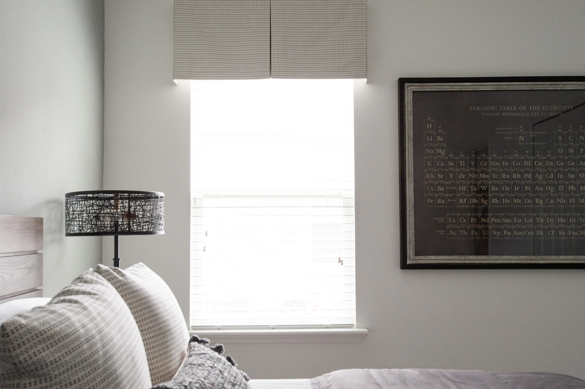
Last but certainly not least, the boy’s room. The design of this room was based off the large Periodic Table of Elements artwork. I love the darker, masculine color palette in the artwork and used it in other elements throughout the room, such as the bedding and metal lamps.


