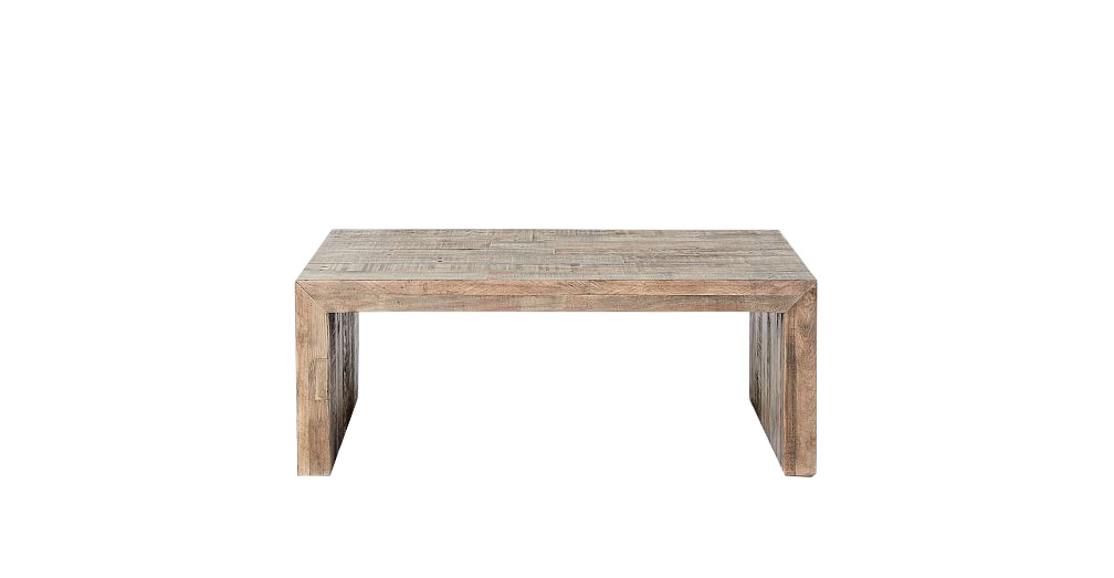
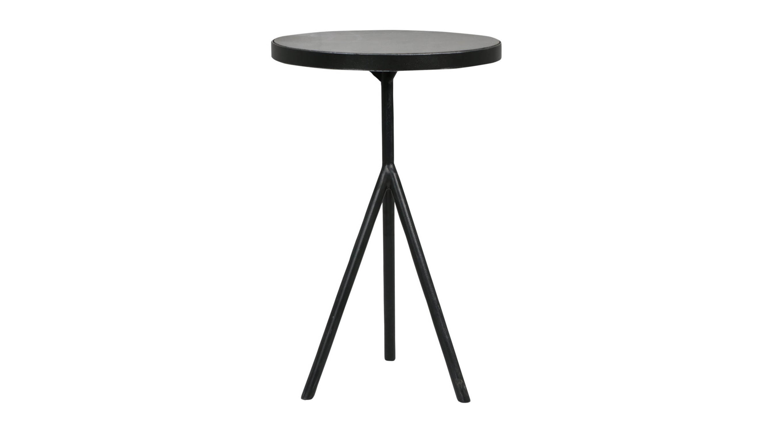
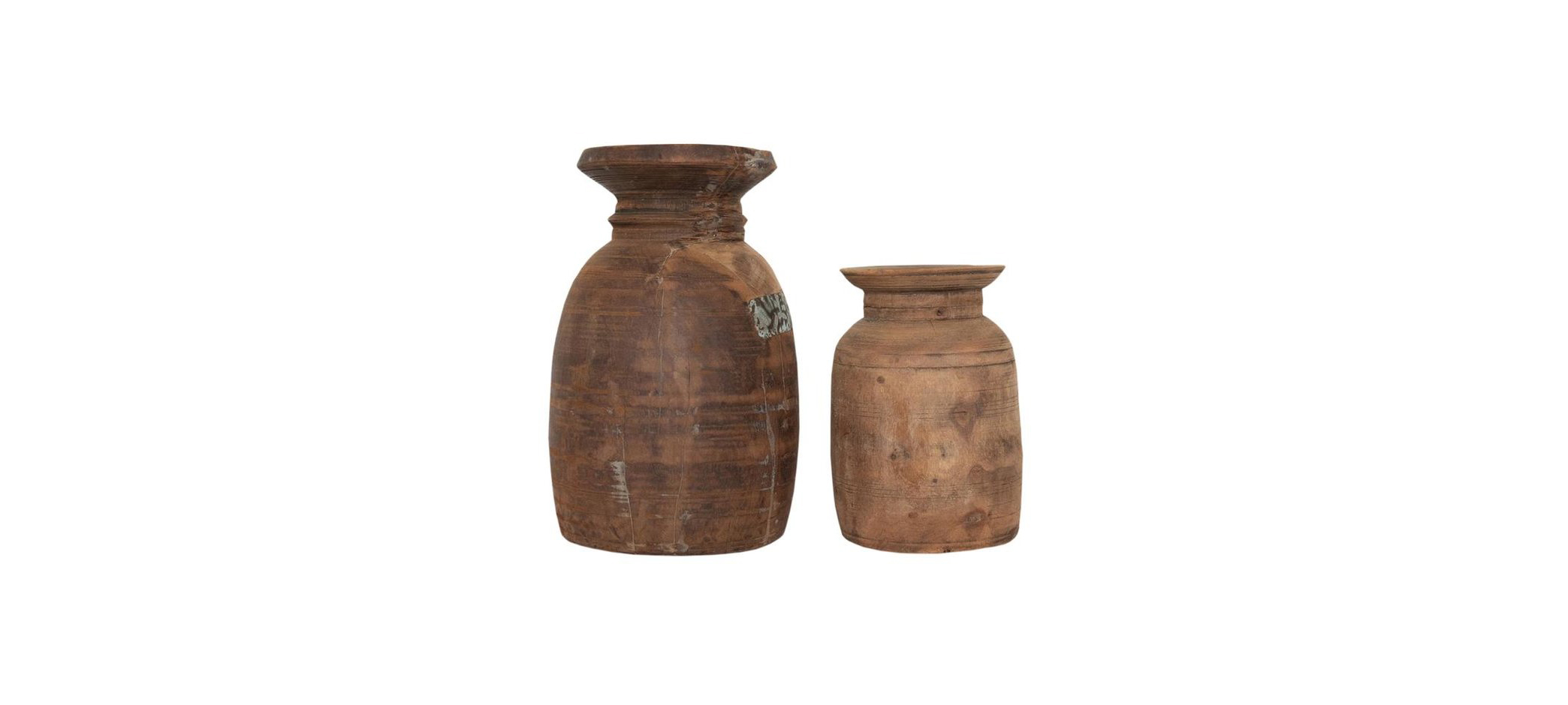
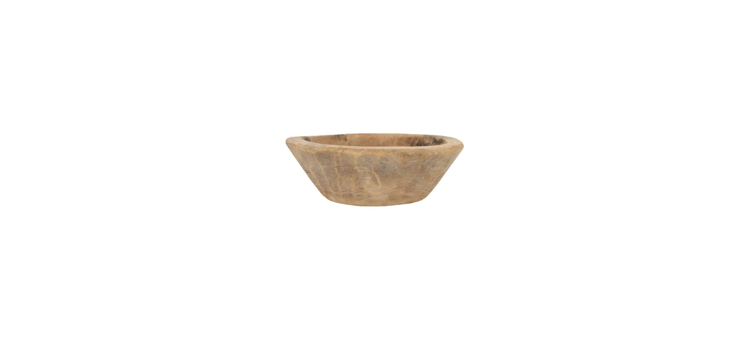
Hi friends! I’m back with another project reveal and I’m excited to share the Orchard Cove model! I love a good coastal vibe as much as the next girl, but I wanted to add a fresh modern twist to this home. I used more neutral wood tones, which are contrasted by the black accents used throughout.
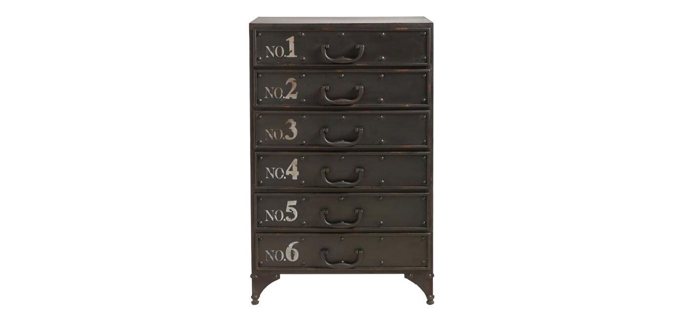
The inspiration for this home really stemmed from this console. It’s such a great statement piece and I loved the rich, orange undertone, and not to mention that dimensional detail on the front.
Similar to the foyer, I selected pieces that had that same natural wood undertone. The same trim detailing in the foyer was also used in the living room, just in a greenish color to cool down all the warm tones. A white, slipcovered sofa was selected to add a cozy element to the living room, while contrasting with the structured, velvet love seat.
SHOP THE LOOK
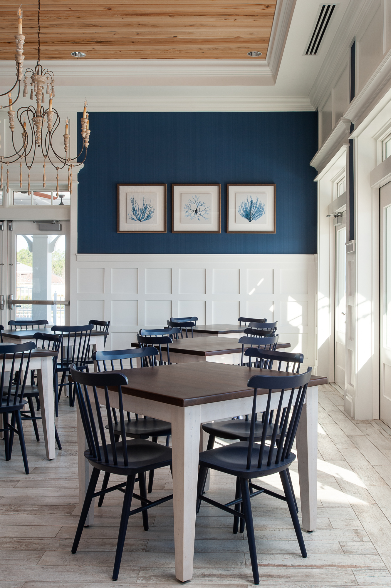
Keeping with the modern coastal look, black cabinets were selected for the kitchen to compliment the black furniture pieces throughout the home. The same paint color (SW Magnetic Gray) was used in the dining room to create a cohesive look.
SHOP THE LOOK
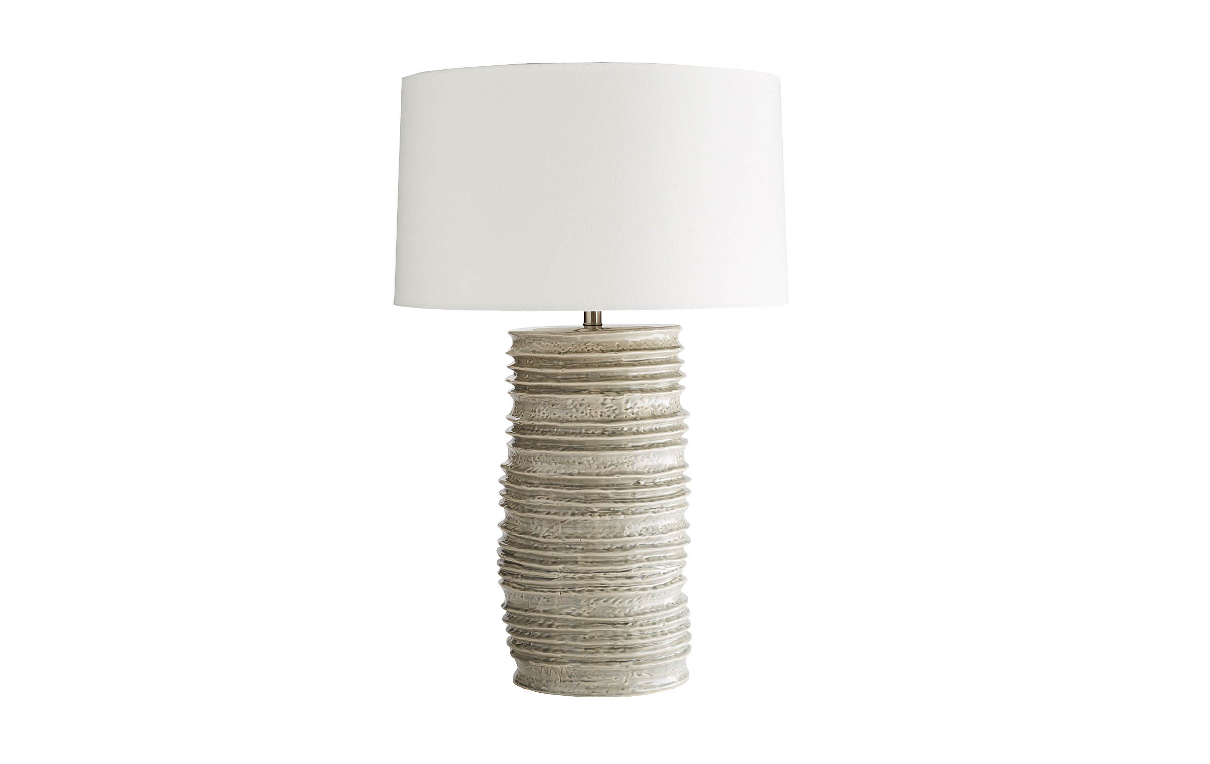
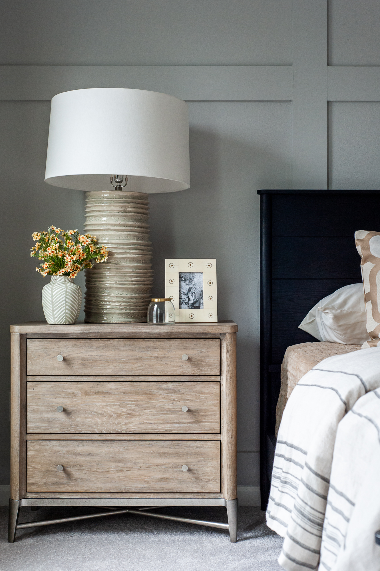
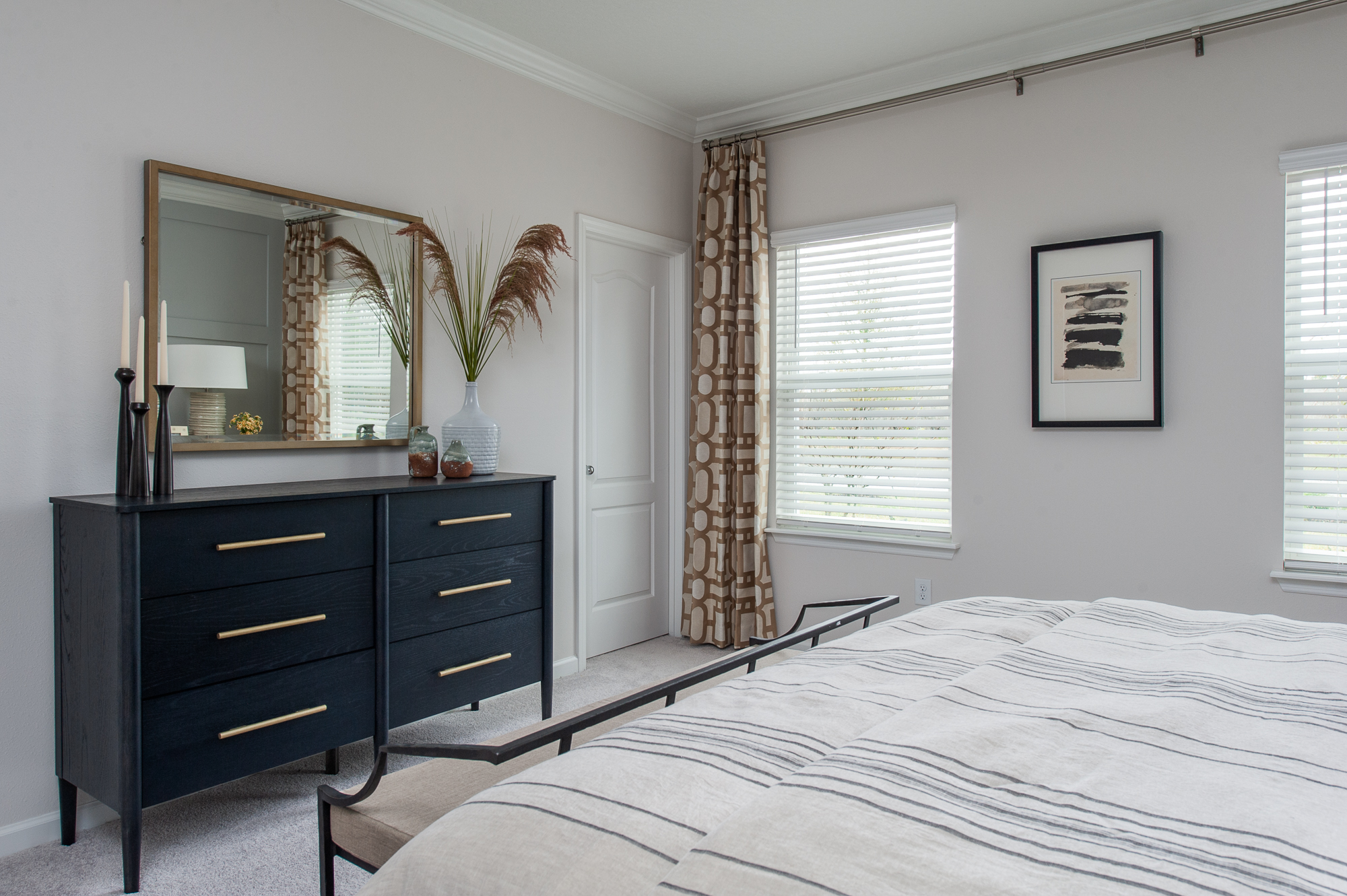
This home has a great color palette of white, green, carmel, and hints of black so I used it in the bed, artwork, and bedding in the owner’s suite. I didn’t want the nightstands to be too matchy-matchy with the bed, so I chose a more natural wood tone, which keeps the space feeling light and coastal. I think my favorite piece in this room is the iron bench at the front of the bed. It adds the right touch of masculinity to the space.
SHOP THE LOOK
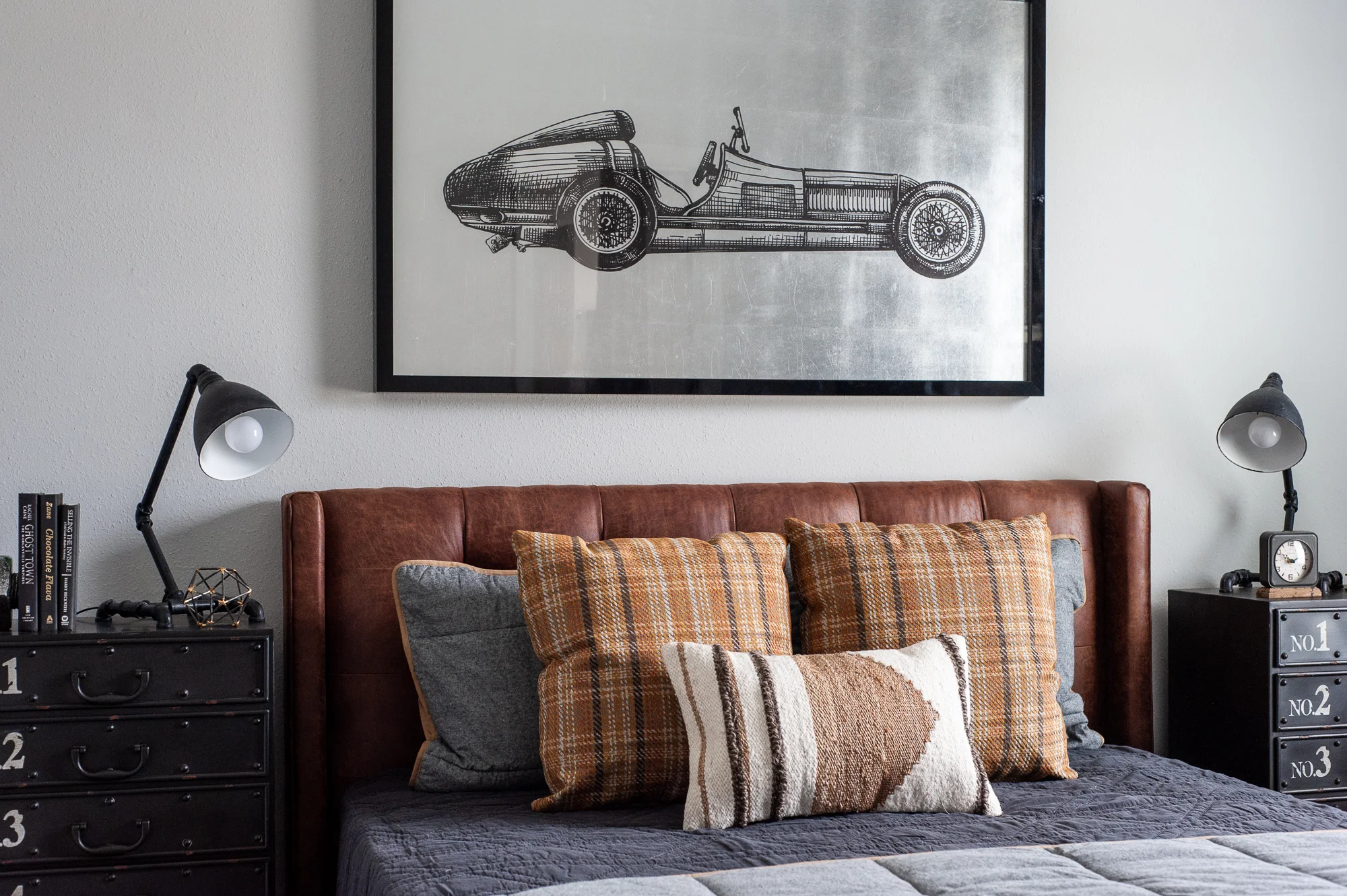
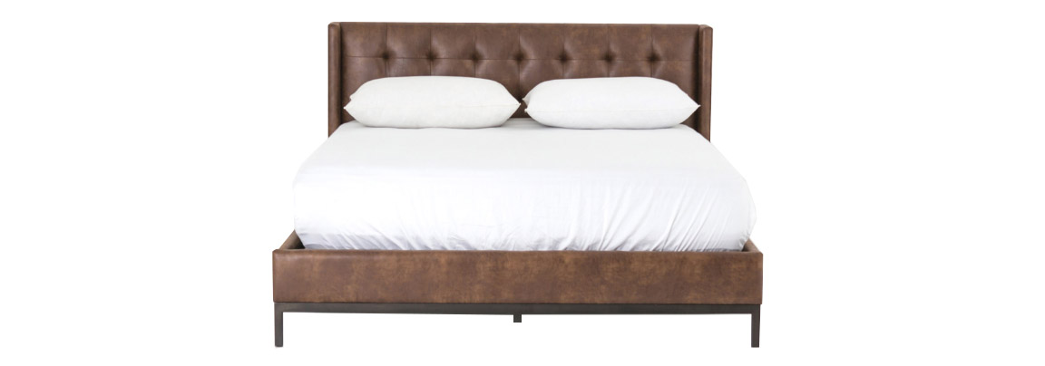
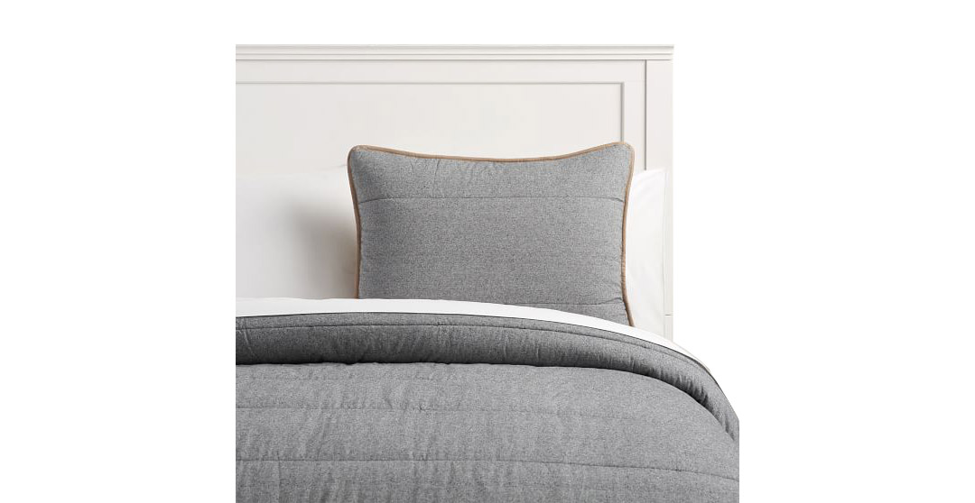
When designing a boy’s room I try to stay away from what you would typically expect. My absolute favorite piece in this room is the artwork… or maybe that leather bed. I can’t decide… It’s all just so good.
SHOP THE LOOK
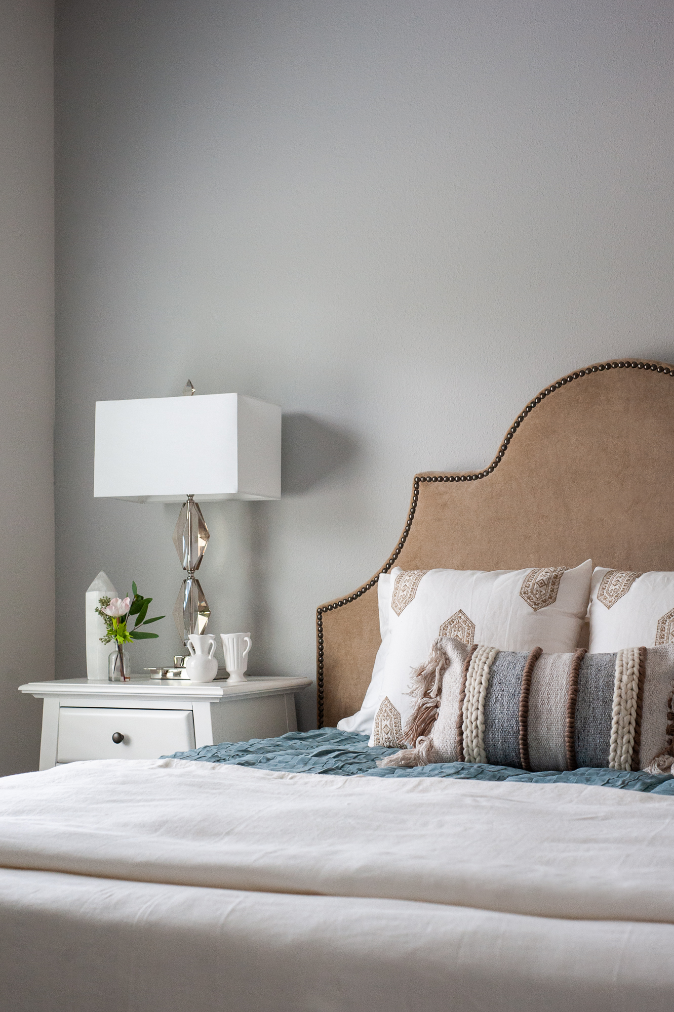
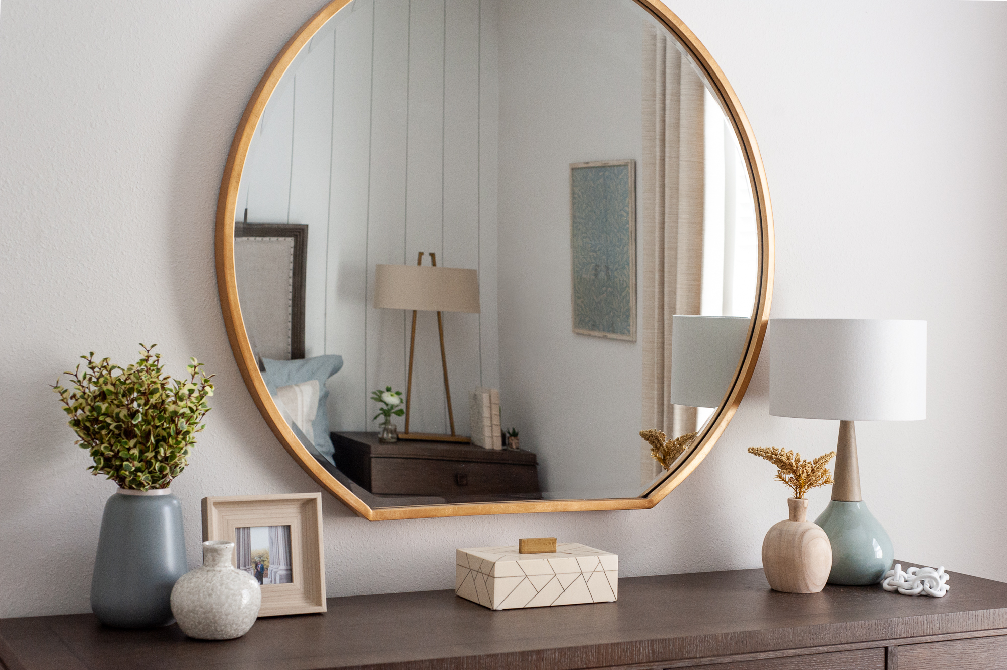
The inspiration for this girl’s room started with the fabric for the drapery and headboard. I love the carmel color on the headboard. The dresser has a geometrical pattern which ties in with the drapery fabric and the shape of the lamps.
SHOP THE LOOK
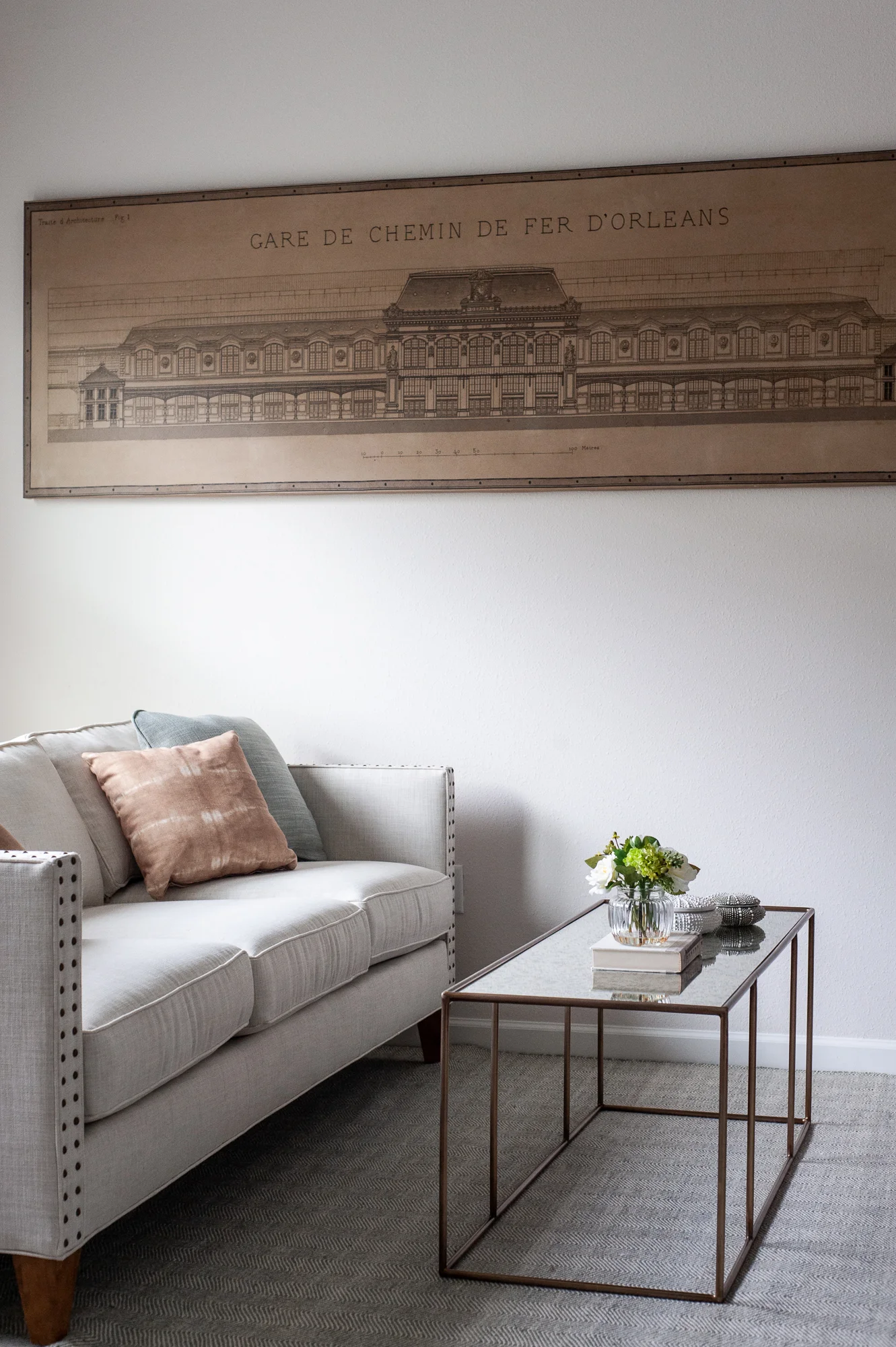
Something builders are starting to incorporate in their portfolio of floor plans is a Next Generation Suite. Baby Boomers are looking to purchase a home with an entire guest suite for their elderly parents rather than pay for a retirement home. The guest suite includes a living space, a small kitchen, and a bedroom with an ensuite bath.
SHOP THE LOOK
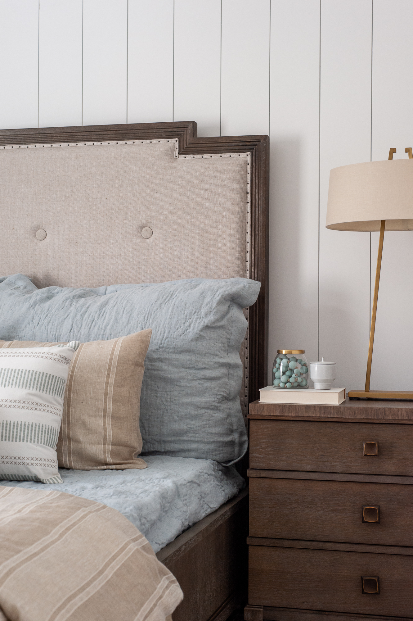
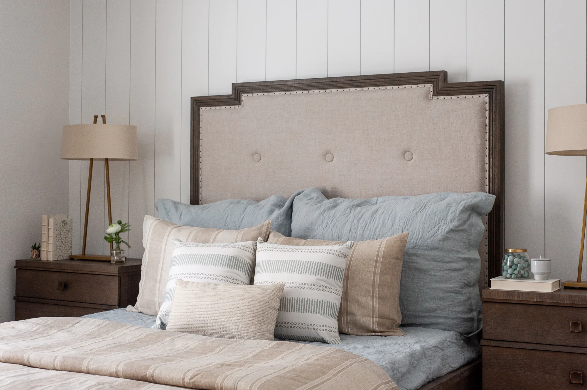
Since the Next Generation Suite is for an elderly couple, the space feels a bit more traditional. Warmer wood tones were used in the Next Generation Suite, while still incorporating the same blue hues used throughout the entire home.


