We’re back with another model reveal and we have so many more to roll out so stay tuned! Today we’re revealing our Greyhawk model we completed back in 2019.
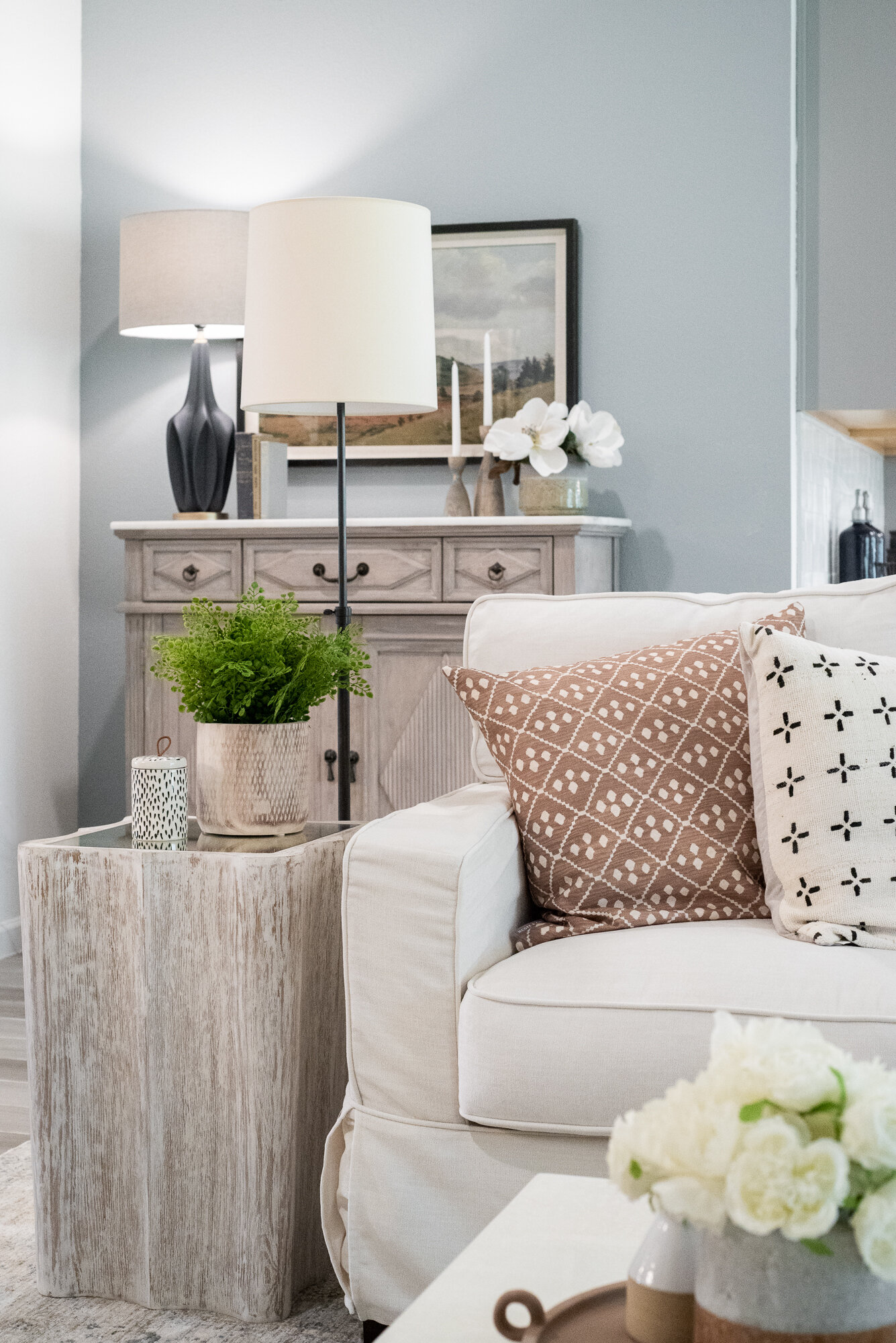
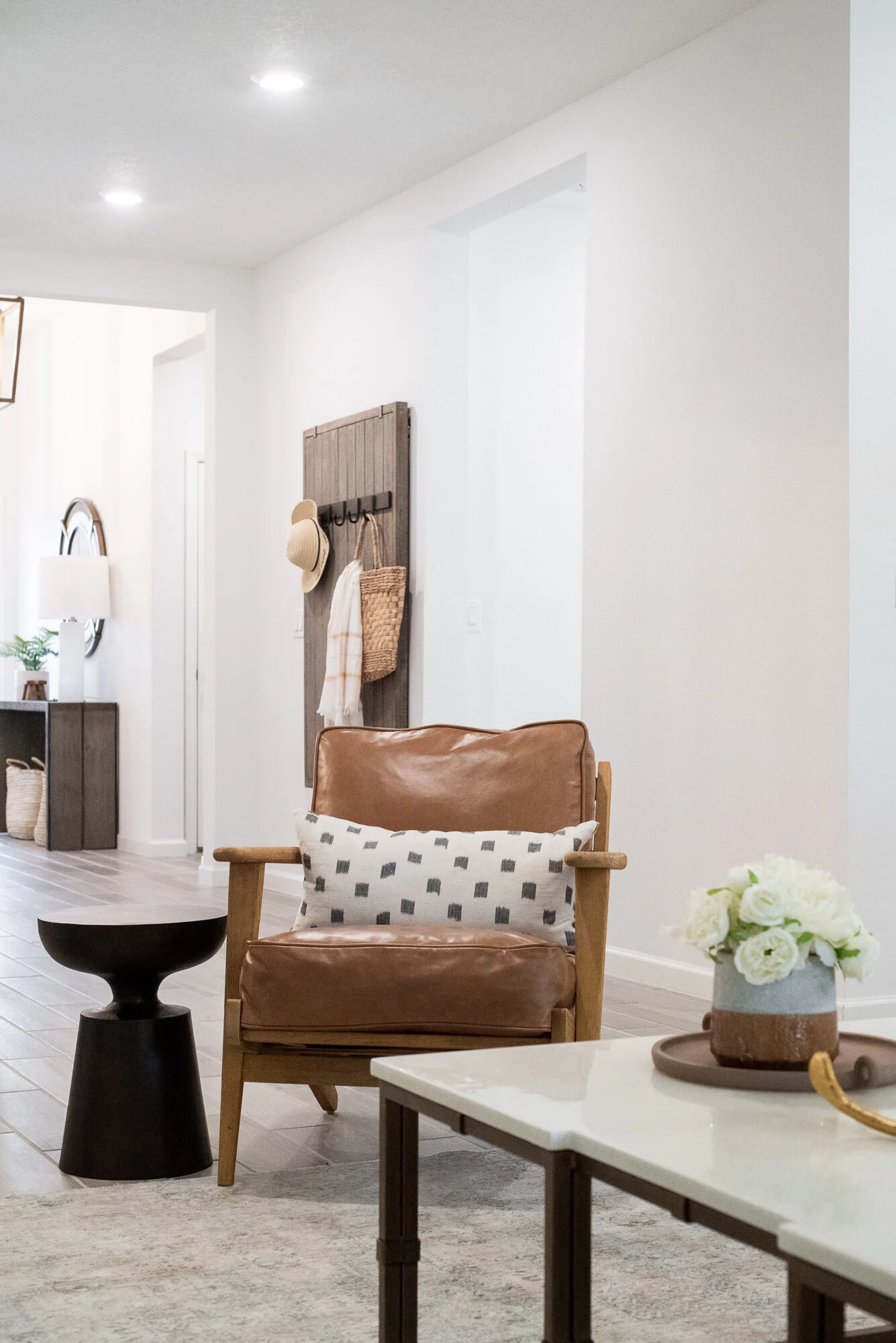
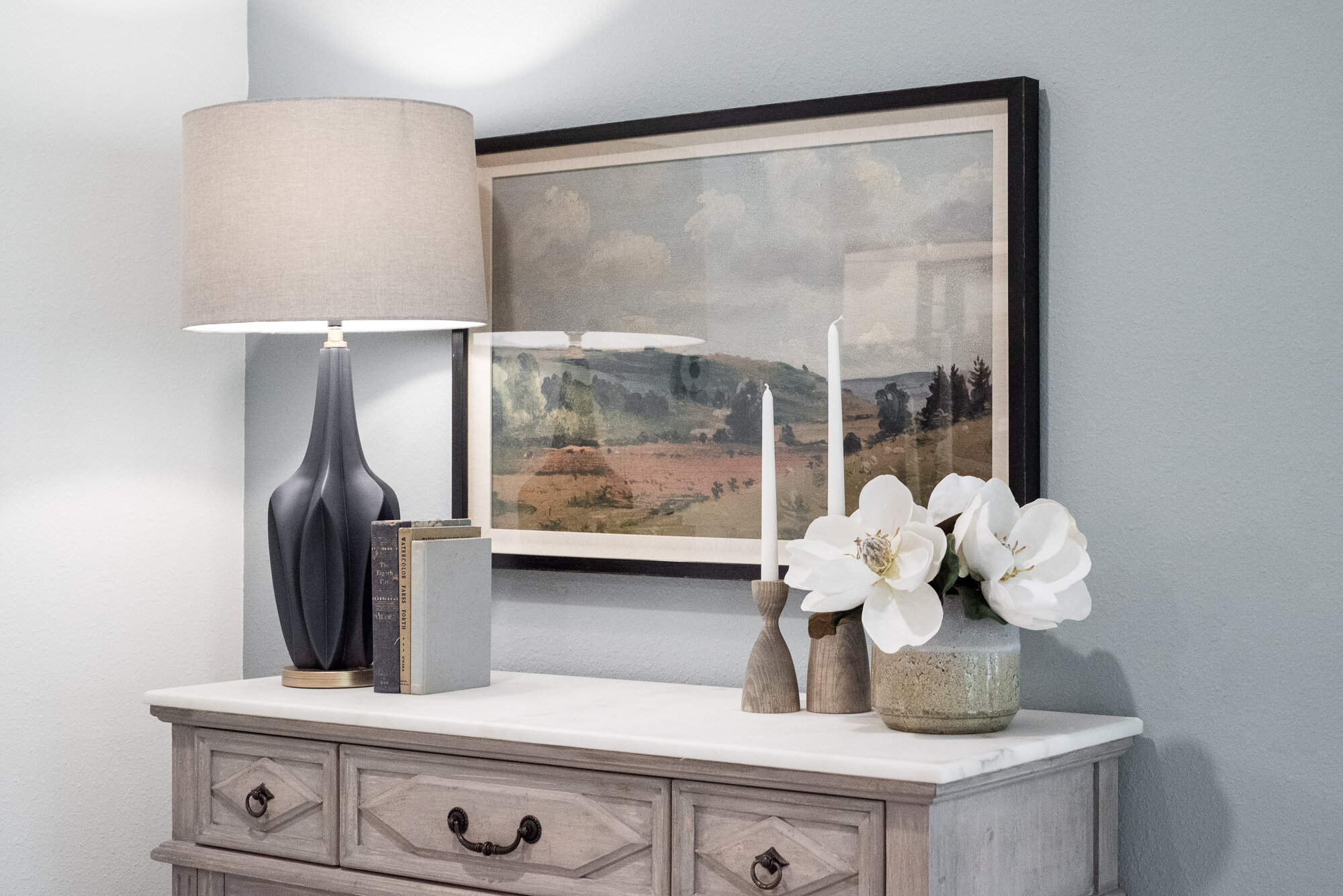
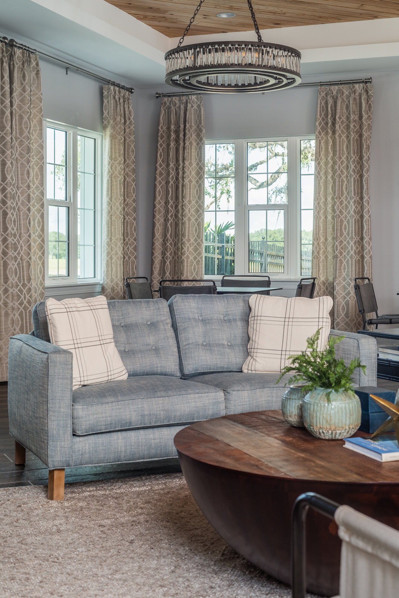
When you first enter this casual and coastal home you’re greeted by clean lines, cool wood tones, and pops of light blue, which carry throughout the main areas of the home.
When designing a home, we always strive to create a well thought out space, but want to add a touch of livability to it all. We’ve added a slipcover to this spacious living room, because anyone with kid’s knows you’re constantly cleaning up their messes. A slipcover is an easy way to keep your white couch looking spick and span.
We’ve added a low, lounger to add ample seating, but not blocking the view to the lanai. It' also looks like a great, comfy place to take a nap. We designed a built-in for the media wall to create more place for storage.
SHOP THIS LOOK
With the rest of the home being bright, white and airy we decided to make the office a little more masculine and moody. We accomplished this look with a high wainscoting, adding a little more texture with the square trim, and painting the trim an inky blue color.
SHOP THIS LOOK
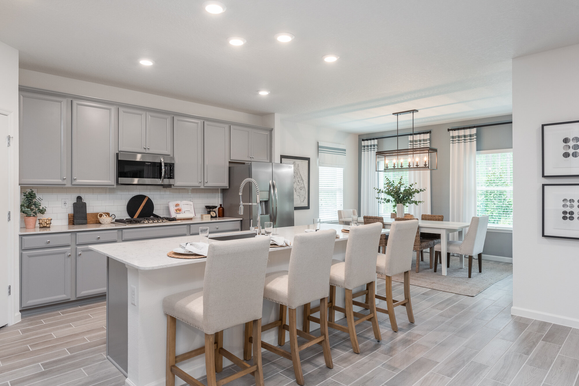
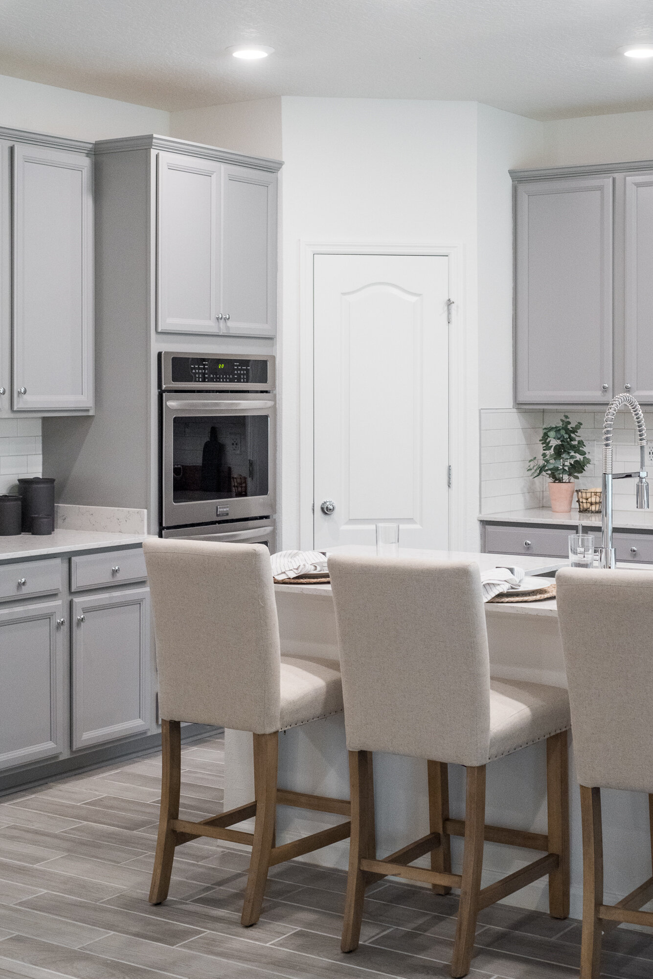
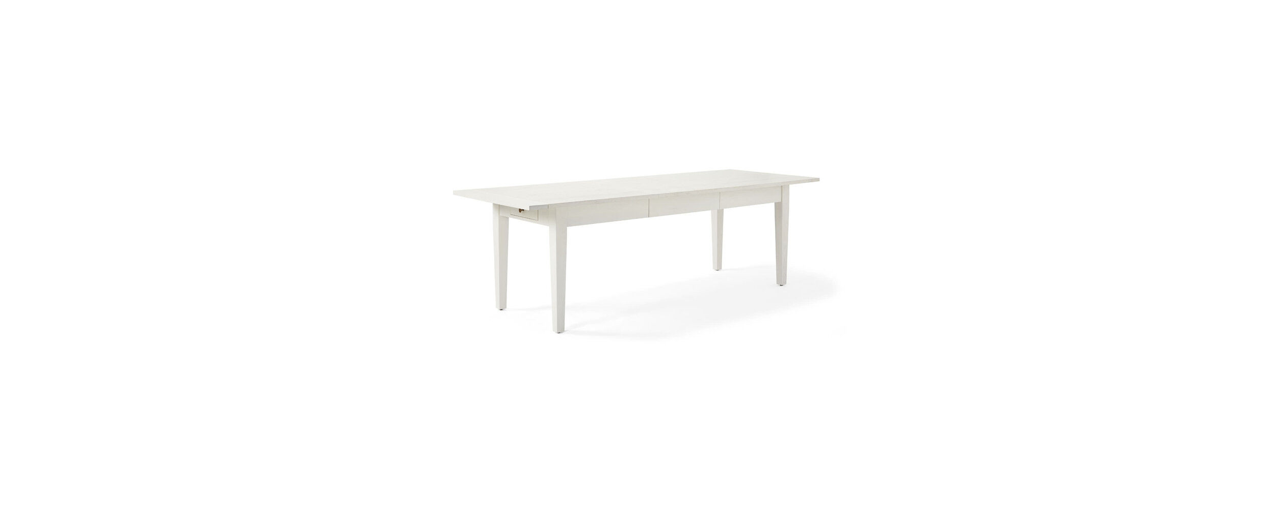
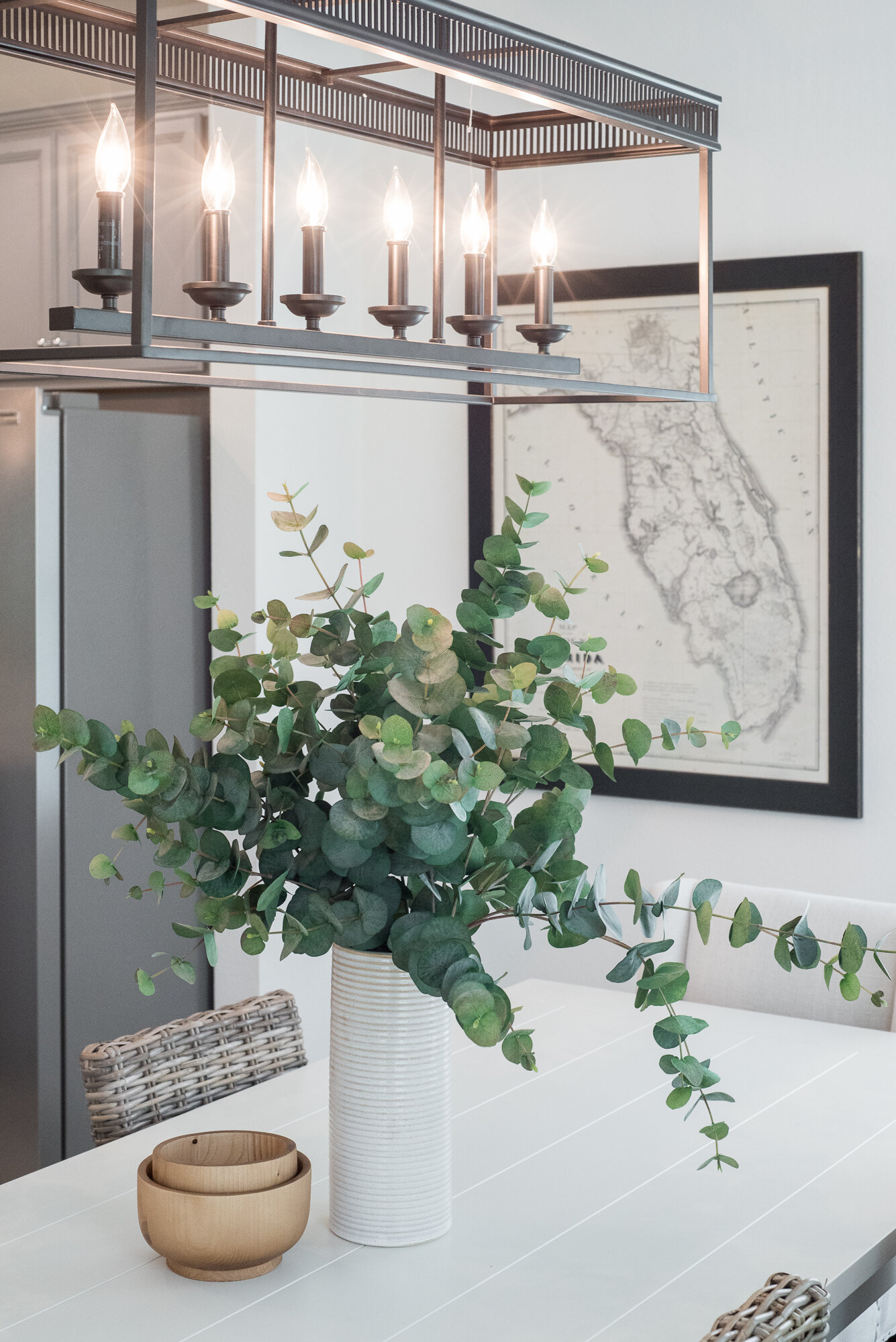
The kitchen and cafe open up to the expansive living room for a very open concept. We didn’t want the kitchen to feel too sterile, so we chose a light grey cabinet which pairs really well with the floors. The cafe has a very modern, coastal feel with a beautiful white dining room table and rattan dining chairs to add in a little texture. We love using a linear chandelier over a long rectangular dining table.
The lanai is right off the living room and acts as a little outdoor oasis for dinners during the summer months.
Okay this Owner’s suite came out better than we could’ve imagined. Just look at that gorgeous ceiling. We love using stained tongue and groove in a ceiling tray to add texture and interest. It really draws your eye up the room.
Keeping with the color palette that’s throughout the entire home, we brought in darker grays along with those burnt orange and light blue hues, which give the space a calming effect.
SHOP THIS LOOK
The boy’s bedroom was designed for a younger boy who is entering high school and loves to play basketball. We used the inky blue color that was utilized in the office to really give the home some uniformity.
The girl’s room was designed for a little girl entering middle school. In little kid’s rooms we love to use multiple colors to make it bright and fun.
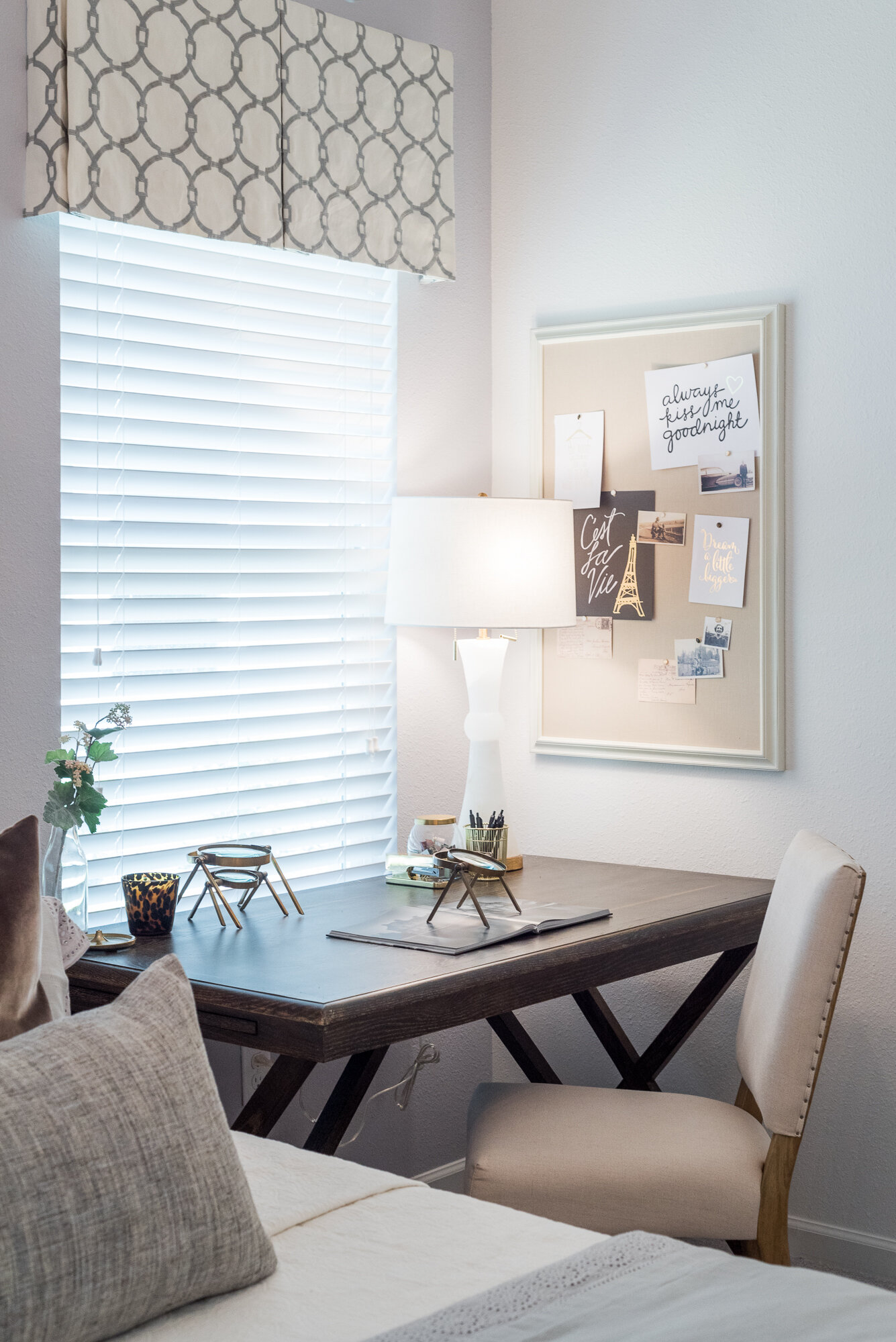
One of our favorite parts of this home is what’s called an in-law suite, which is essentially a mini home attached to the main house. It includes a small kitchen, living room, laundry closet, bedroom and it’s own bathroom. They usually have their own single car garage attached as well.
We wanted to take a different approach to this space, so we designed it for a college aged girl who is about to graduate from UNF, but plans to stay in town for grad school. This space can easily transition into an area where the homeowner’s parents can live.
Thanks for stopping in to read about this project! Don’t forget to shop the looks throughout.


