Happy Thursday friends! We tackle many aspects of design here at Micamy Design Studio. We’ve shown you clubhouses, residential models, event spaces, commercial offices and a veterinary hospital. But that’s not ALL we do, we also design for a lot of doctors offices here in North Florida.
From Ophthalmology to OBGYN and a few others in between, we work closely with these skilled professionals to meet all of their requirements to improve both the patient and employee experience. Our Director of Corporate Interiors, Sue Brown, spends a lot of time researching code compliance for the specialty medical equipment needed in these spaces.
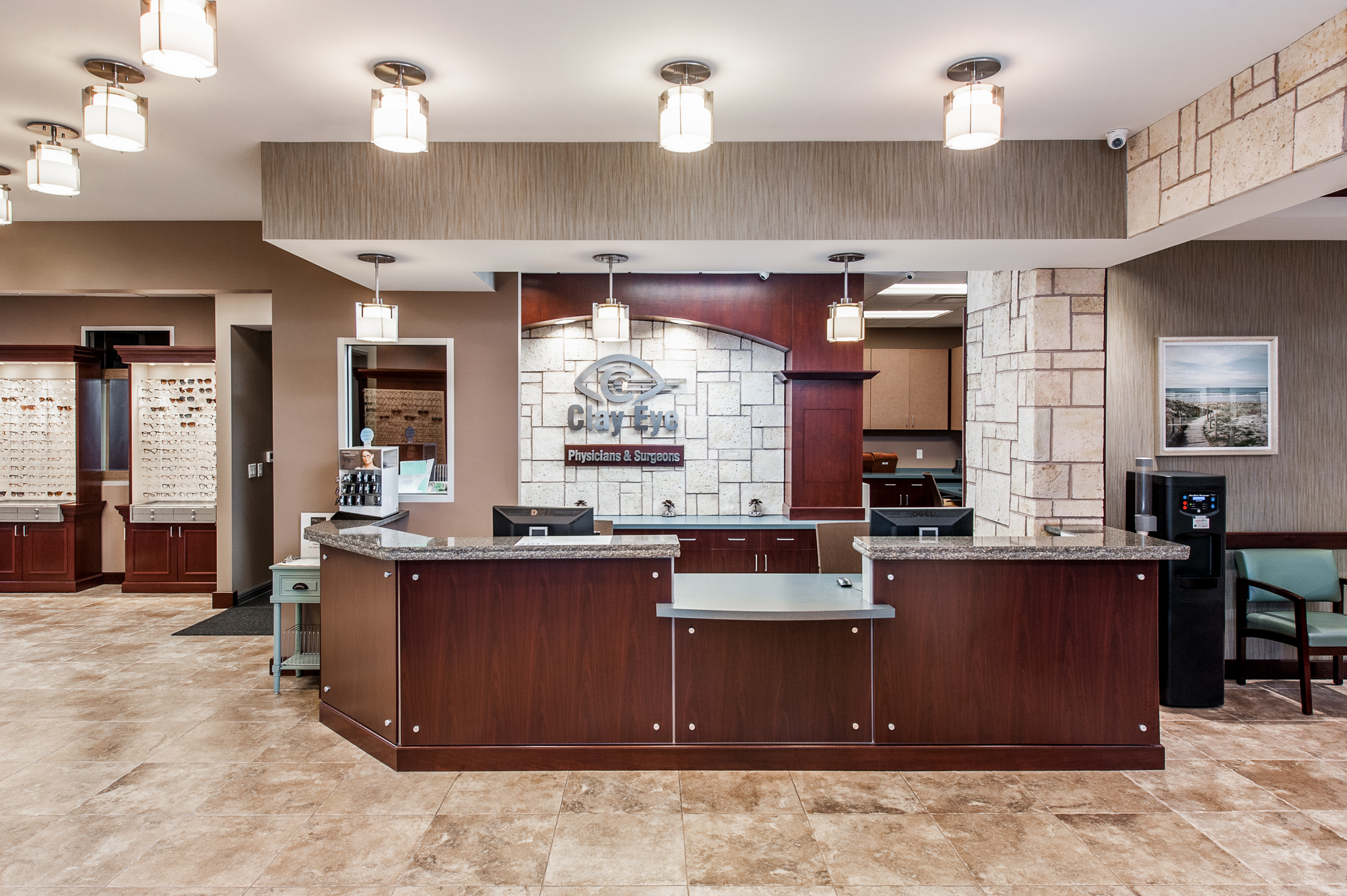
The reception area was completed by Micamy Design Studio a few years ago and was designed to be warm and welcoming for Clay Eye’s patients and employees. The soft color palette was selected to ensure a calming experience for visitors. When Clay Eye began to grow rapidly beyond its’ control they once again relied on Micamy to design their expansion and renovation.
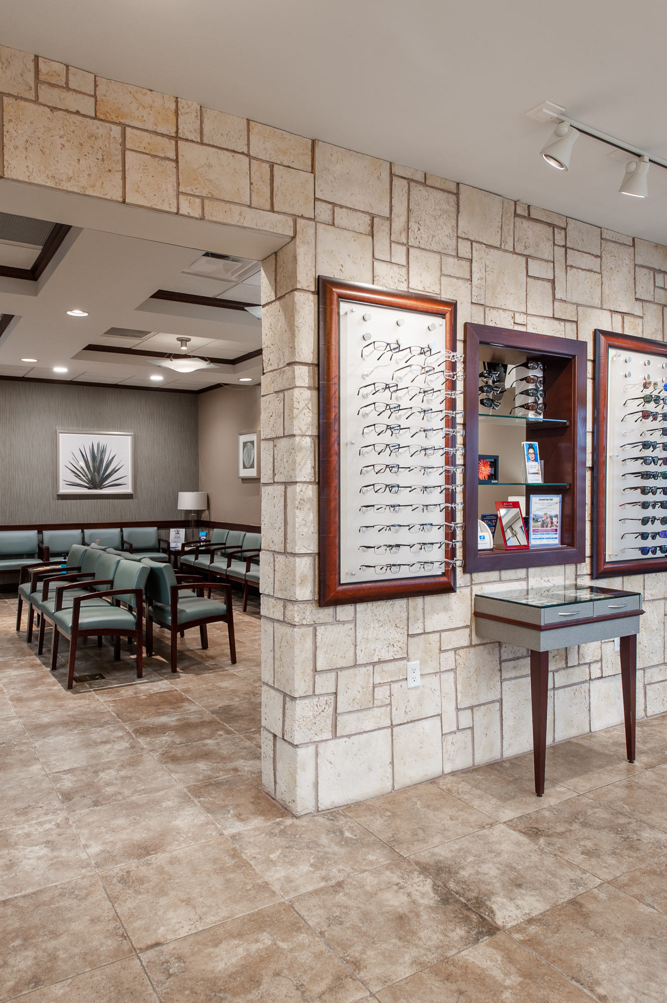
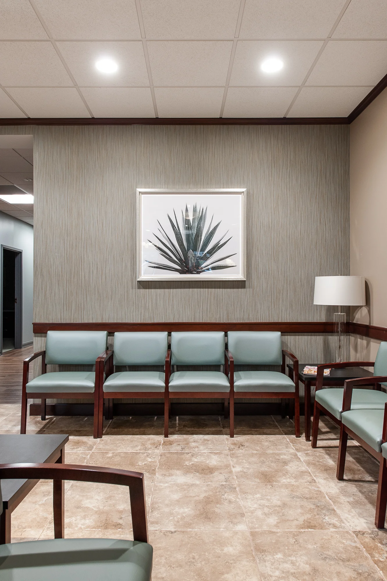
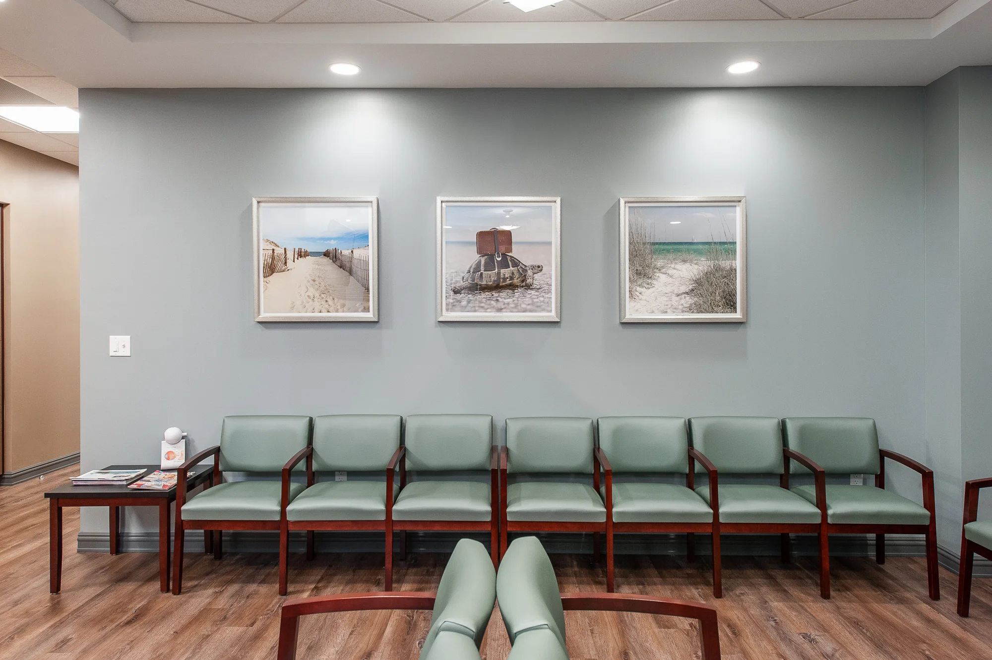
Clay Eye is visited by hundreds of patients a day, so it was very important to provide ample waiting areas to assist with the flow of the doctors office. The waiting room was designed to be spacious and comfortable but we still wanted it to be attractive to the eye. We used standard Bariatric chairs with a beautiful teal vinyl that is complimented by the wall covering and artwork within the space.
To ensure there are no traffic jams within the office, we provided two additional waiting rooms strategically placed around the building. Making it more efficient for doctors to assist their patients. The over sized exam room at the heart of the expansion wing was intended to provide patient comfort and privacy for the new exam rooms.
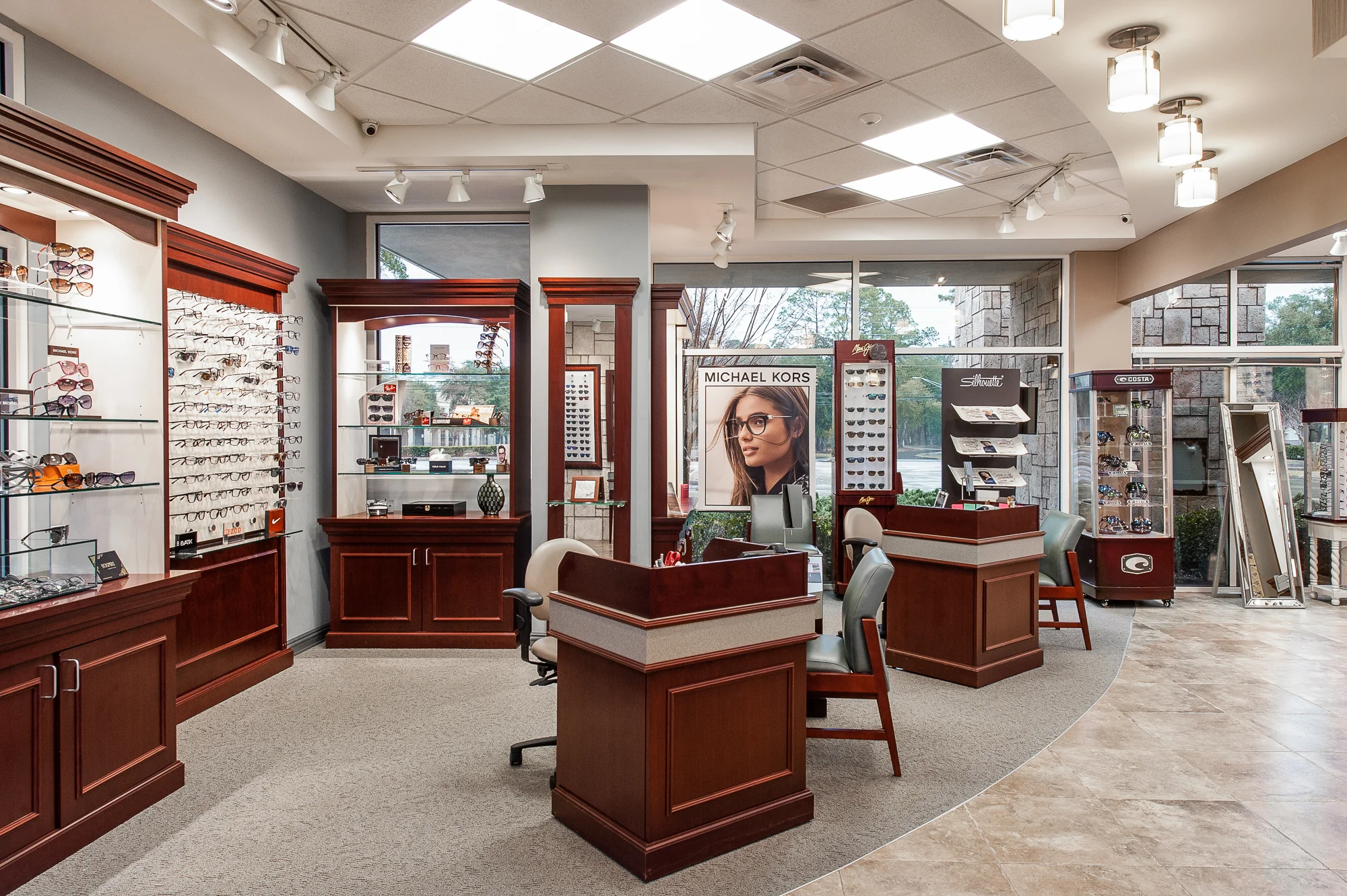
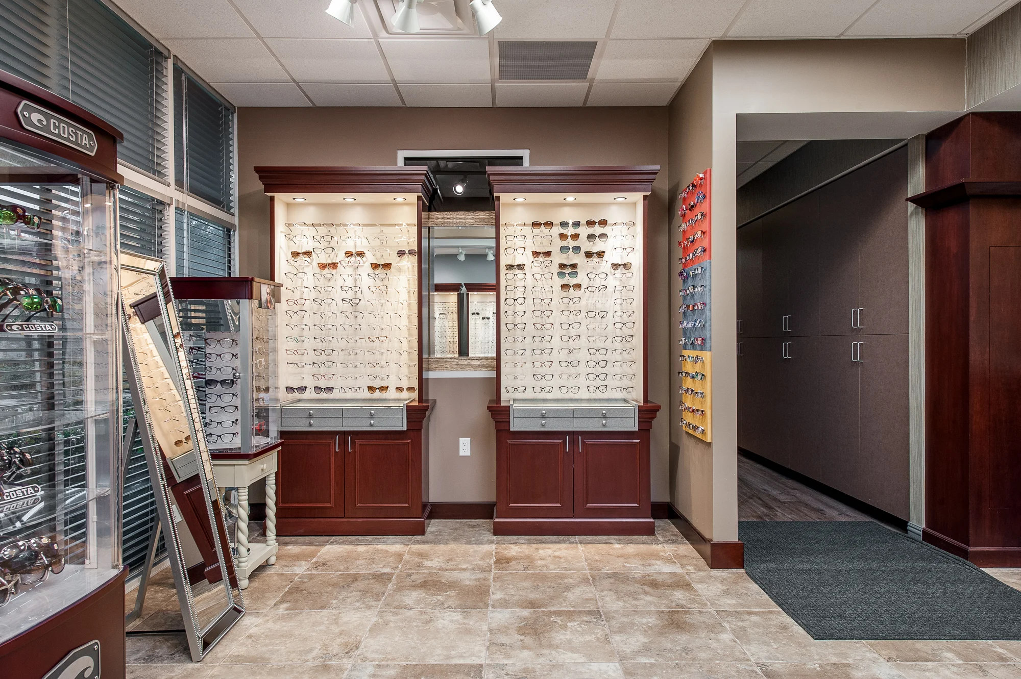
The doctors and nurses offices also received face lifts during the expansion. We tied in all of the new design elements to co-exist with the old finishes to provide a cohesive design for our client. Upon leaving your appointment you are then greeted by the retail section of the office.
PROJECT CHALLENGE:
This project's greatest challenge was that it became a balancing act to tie in the old finishes with the new. We wanted the expansion to appear fresh and new while not taking away from the original design intent. In the end we achieved a concise traffic flow and an aesthetically pleasing design.
— Sue Brown, RID


